

0


| Thumbs Up |
| Received: 7,646 Given: 10,364 |
None. IMO, Rome had the right idea. Europe and the Mediterranean region need to work together. Religions be damned.

| Thumbs Up |
| Received: 10,410 Given: 27,480 |
SameOriginally Posted by Samnium


| Thumbs Up |
| Received: 26,888 Given: 16,895 |
None.
Even Poland got good sides, wherever Peterski is not aroumd in Poland is a good place.

| Thumbs Up |
| Received: 1,840 Given: 2,076 |
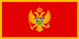
The flags that include some kind of a complex coat of arms or graphic design are usually ugly. Montenegro's flag is maybe worst. The coat of arms looks scary, like it's the emblem of some orcish dark country. The color scheme is also ugly. And the 2:1 aspect ratio looks dumb. Sorry my montenibbas...
I think all flags should have some standard aspect ratio, like sqrt(3):1, sqrt(2):1, (1+sqrt(5)):2, or 3:2. Switzerland's flag is also dumb because it has a 1:1 aspect ratio.
16:9 (1.777...) is a pretty good aspect ratio because it's close to sqrt(3) (≈1.732). However I think the standard aspect ratio for flags should rather be based on some more fundamental number (like sqrt(3)) that does not involve arbitrarily selected large integers (like 16:9). For the same reason ISO paper sizes are cooler than American paper sizes.
Last edited by Ymyyakhtakh; 05-16-2020 at 09:58 PM.


| Thumbs Up |
| Received: 6,343 Given: 3,478 |
Ugly colors and pattern that look like it was draw on a retro-game
"Allobroges vaillants ! Dans vos vertes campagnes,
Accordez-moi toujours asile et sûreté,
Car j'aime à respirer l'air pur de vos montagnes,
Je suis la Liberté ! la Liberté !"


| Thumbs Up |
| Received: 25,690 Given: 23,946 |


| Thumbs Up |
| Received: 15,246 Given: 9,844 |
Basically polish users are decent members, except Peterski he is another dimension...

| Thumbs Up |
| Received: 25,620 Given: 21,626 |
When I opened the thread I thought who would be the first member answering the question in this way. I see now that first one was Samnium and second one you.


| Thumbs Up |
| Received: 6,904 Given: 4,896 |
Los del balconing.


| Thumbs Up |
| Received: 34,729 Given: 61,129 |
Wake up and smell the coffee.
There are currently 1 users browsing this thread. (0 members and 1 guests)
 Posting Permissions

 Reply With Quote


Bookmarks