

0


| Thumbs Up/Down |
| Received: 2,302/142 Given: 339/68 |
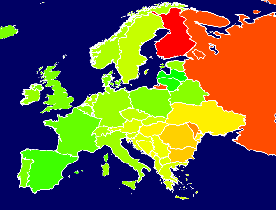
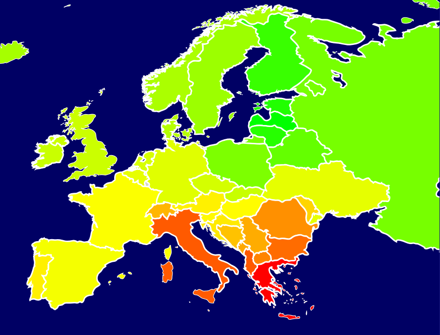
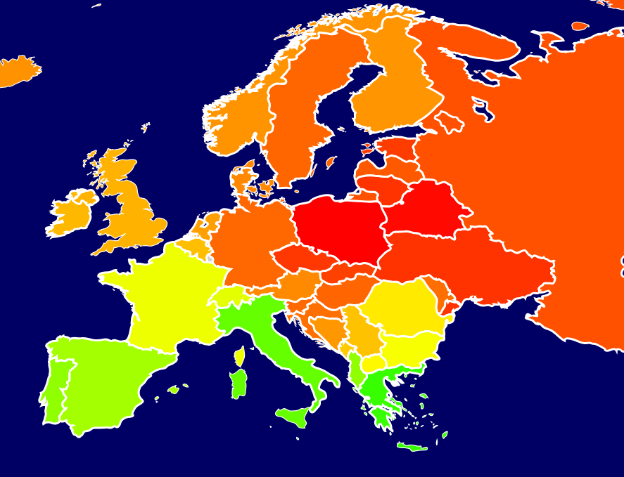
To what populations they are closer to.
Heat maps.
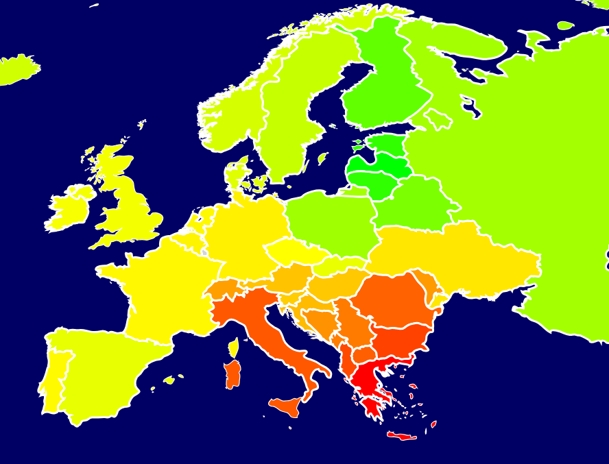
Volga-Ural (Tatars, Udmurts, Chuvash)
Central Asia (Kazakhs, Uzbeks, Kyrgyz)
Caucasus (Circassians, Chechens, Georgians)


| Thumbs Up/Down |
| Received: 542/0 Given: 6/0 |
ok and??
| Thumbs Up/Down |
| Received: 2,302/142 Given: 339/68 |
Originally Posted by Wend-Kruzek

What do you think???


| Thumbs Up/Down |
| Received: 3,971/24 Given: 7,367/31 |
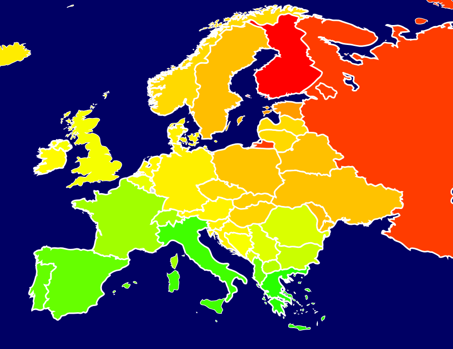
all these maps show that Poles are different from Ukrainians, great thing
| Thumbs Up/Down |
| Received: 2,302/142 Given: 339/68 |
Polish
Ukrainian
No significant difference at all.


| Thumbs Up/Down |
| Received: 224/4 Given: 56/1 |
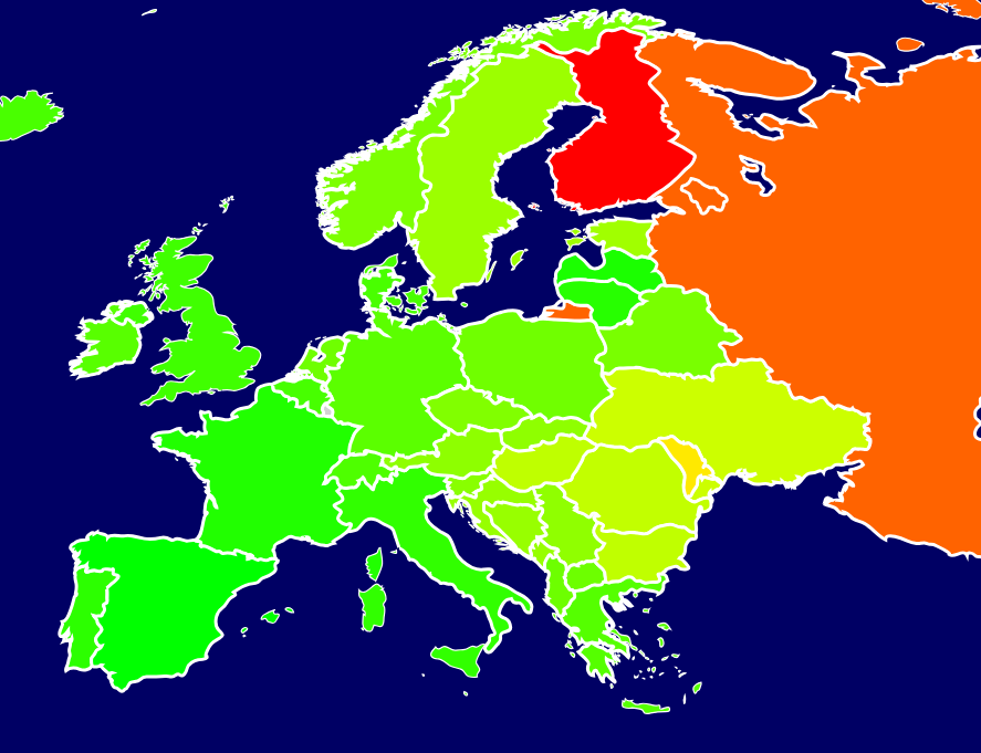
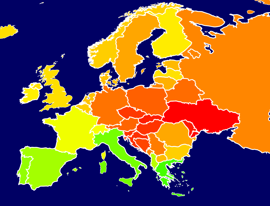
This can be a comforting thought, but the reality is complicated by several nuances:
1). These maps don't disclose which specific coordinates were used for each country's supposed genetic average, thus depriving the reader from the ability to question if the selected averages accurately reflect the national average;
2). The scale is amplified for an easier sensory comprehension. The actual scale difference on these maps is something along the lines of 0.15 (green color) and 0.16 (red color). So a difference of a few per cent in closeness gets amplified to the scale's two absolute extremes (green and red);
3). For the pure experiment of comparing Poles and Ukrainians (or any other two populations), you have to directly run them against each other (distance). The resulting distance then should be taken and juxtaposed with other distances within the used framework for interpreting the scale.
So sorry for spoiling a comforting thought, but these maps do not prove (or disprove) the supposed extreme differences between Poles and Ukrainians.


| Thumbs Up/Down |
| Received: 5,488/8 Given: 4,619/11 |
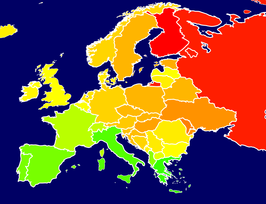
In the structure of the Y chromosome, this is very obvious. Here, the distance is from a Serbo-Lusatian.

There are currently 1 users browsing this thread. (0 members and 1 guests)
 Posting Permissions

 Reply With Quote
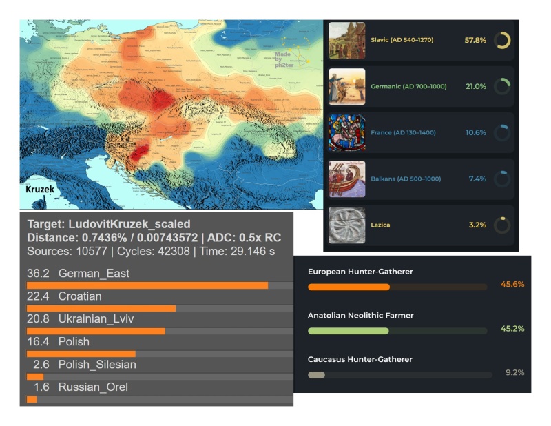
Bookmarks